The popular advice is simple: put checkout on one page and more shoppers will buy. That skips the important question: what work have you really removed? A single screen can save shoppers from unnecessary navigation, but it can also confront them with a crowded form, unclear payment choices, and errors they can't find.
Judge one page checkout by the fields and friction it removes, not by its page count. The right design helps shoppers understand the total, provide only necessary information, recover from mistakes, and pay confidently.
Table of Contents
- One Page Versus Multi-Step Checkout Compared
- What the Conversion Evidence Shows
- How a One Page Checkout Consolidates the Purchase
- Field Count and Load Speed That Keep One Page Usable
- Payment Choice and Trust on a Single Screen
- Accessibility Traps in a Dense Single Screen
- Metrics to Track Beyond Conversion Rate
- Decide Whether One Page Checkout Fits Your Store
One Page Versus Multi-Step Checkout Compared
One page checkout puts customer details, delivery, payment, and order review in one continuous interface. Multi-step checkout separates those tasks across screens. The difference is how shoppers move through the purchase, not whether the merchant still needs an address or payment authorization.
A continuous interface can still contain expandable sections. It also doesn't have to fit inside a single browser viewport, especially on a phone.
One page versus multi-step checkout on the criteria that matter
| Criterion | One page checkout | Multi-step checkout |
|---|---|---|
| Screens shown to the shopper | One continuous interface | Separate screens for details, delivery, payment, and review |
| Where errors appear | Inline, next to each field | On the step where the error was made, sometimes after navigation |
| When shipping cost appears | In the same view as the total, once the destination is known | Often at the delivery step |
| Best fit | Short catalogues, repeat buyers, wallet-heavy traffic | Complex carts, B2B forms, heavy tax or shipping rules |
| Main risk | A dense form that feels overwhelming | Extra clicks and lost momentum between steps |
| Metric to watch | Completion rate by device and payment method | Drop-off between each step |
Treat the comparison as a starting point
Neither layout wins by default. A well-organized multi-step checkout can make a complicated order manageable, while a crowded single page can make a straightforward purchase feel difficult.
The table describes useful design tendencies, not technical limits. Either layout can reveal shipping costs early, preserve entered information, and show helpful errors if the team implements those behaviors deliberately.
For a broader diagnostic before changing layouts, MD TECH TEAM's guidance to improve your ecommerce checkout flow offers a useful companion to a form audit. Inspect the journey shoppers have today, rather than assuming its replacement needs fewer screens.
One page isn't one-click checkout, either. One page describes the interface; one-click describes an accelerated purchase using previously supplied details.
What the Conversion Evidence Shows
One page checkout is a friction-reduction milestone, not a guaranteed conversion formula. A single screen is an interface choice, not proof that fewer details are required. Field counts show how much work a checkout asks for. They do not prove that placing those fields on one page causes shoppers to finish.
Checkout field and conversion evidence by source
The field-count and abandonment figures come from Baymard's checkout-flow analysis. Treat them as a measure of information burden, not a promise that every store gains the same amount from a redesign.
| Evidence | Measure | Reported value | How to read it |
|---|---|---|---|
| Baymard 2016 benchmark | Average form fields | 14.88 | Baseline before the later improvement |
| Baymard 2019 benchmark | Average form fields | 12.8, a 14% improvement from 2016 | Many sites could reach about 6 to 8 fields in guest checkout |
| Baymard recent data | Average steps and form fields | 5.1 steps and 11.3 fields | Field burden matters more than step count |
| Baymard 2019 survey | Users abandoning due to length or complexity | 26% | Points to complexity, not layout alone |
Merchant reports of gains after moving to one page vary, and the improvements are often modest. Those accounts rarely include a controlled comparison, so they are useful as directional signals, not forecasts for another store.
Read the gap carefully
The historical benchmarks describe a reduction in information-entry burden. They do not show that every removed field produces the same benefit, or that a shorter form must appear on a single page. A checkout with fewer required details can still fail if shipping rules, payment options, or error messages are unclear.
A merchant's reported improvement is not a reasonable forecast for another store. Its shoppers, previous checkout, payment mix, and simultaneous changes may differ. Do not reinterpret an unspecified percentage improvement as a percentage-point increase.
Testing principle: A layout change deserves credit only for an improvement you can distinguish from changes in traffic, offers, payment availability, and measurement.
Establish your own starting point before redesigning. Use ecommerce conversion rate benchmarks for context, but record checkout completion separately from sitewide conversion so you are comparing the same journey.
If you need outside help structuring the diagnosis, Shugert Marketing's CRO fix service is a relevant option to evaluate. Keep the assignment specific: document the baseline, identify the suspected friction, and test a defined change rather than promising a universal uplift.
How a One Page Checkout Consolidates the Purchase
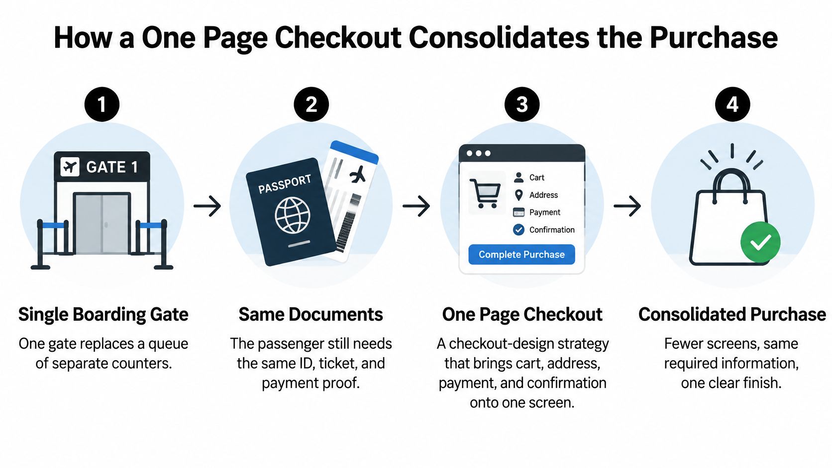
Think of a single boarding gate replacing a queue of separate counters. The passenger still needs the right documents, but no longer has to work out which counter handles each task.
One page checkout follows the same principle. It consolidates the purchase into a continuous interface without pretending that delivery information, payment checks, or order review are unnecessary.
The illustration shows the consolidation concept, rather than requiring every checkout to use identical stages.
Follow the purchase in order
-
Confirm the cart. Show the product, variant, quantity, and current price. Let shoppers correct an accidental selection without restarting checkout.
-
Enter contact details. Support browser autofill and use recognizable field labels. Explain where the order confirmation will go so the request has an obvious purpose.
-
Select delivery. Calculate available methods from the destination and show their costs and delivery estimates. A shopper choosing collection shouldn't have to complete irrelevant delivery fields.
-
Choose payment. Offer eligible express wallets alongside manual payment entry. Keep the selected method clear, especially when choosing it changes which information is required.
-
Review and place the order. Present the final total and a clearly labeled purchase button. If delivery, tax, or discounts change the payable amount, update the review before authorization.
-
Confirm the purchase. Show whether payment succeeded, identify the order, and explain what happens next. Keep any optional post-purchase add-on separate from confirmation so shoppers know the original purchase is complete.
Keep the order consistent
These stages should update the same order state, meaning the shared record of products, prices, delivery, discounts, and payment status. Otherwise, a shopper can select a delivery method in one component while another component still displays an outdated total.
In Baymard Institute's checkout usability benchmark, the average U.S. checkout displayed 23.48 form elements by default, while usability testing found an optimized checkout could use approximately 12 elements. Elements include controls such as checkboxes and dropdowns, not just text-entry fields.
The distinction matters when auditing your own form. Map the current journey onto the stages above, then mark where shoppers must repeat information, leave the interface, or resolve a confusing update. Consolidation is useful when it removes those interruptions, not when it places them closer together.
Field Count and Load Speed That Keep One Page Usable
One page isn't automatically easier. Baymard's one-page checkout analysis reports an average of 19.9 checkout form elements and identifies excessive or confusing requirements, rather than page count alone, as a central usability problem.
Start with a field inventory. Record why each control exists, which shoppers need it, and what breaks if you remove it.
Ask only for information the order needs
- Use conditional requirements. Render fields according to the selected country, shipping method, tax treatment, and payment instrument. Don't make every shopper complete a business tax field because some wholesale customers need it.
- Reuse supplied information. Support address autocomplete and wallet-provided billing details. Keep a manual address-entry route available when suggestions don't match.
- Separate optional requests. Keep account creation and marketing consent outside the critical purchase path, with choices clearly explained rather than preconditions for payment.
- Make costs reviewable. Show shipping, delivery estimates, discounts, and the payable total before the shopper authorizes payment.
For a concrete small-store context, Ovenbell's guide from hosted shop to first order is a useful companion. A bakery checkout, for example, should ask collection customers for collection-related choices, not carry over every requirement from its delivery workflow.
Validate fields without interrupting reasonable typing. If an address is incomplete, explain what to fix beside the relevant field and preserve everything else.
Track focus, error, correction, and abandonment events, but don't send raw addresses, card details, or other sensitive field contents to analytics. Event names and validation categories are enough to identify recurring problems.
Apply the same restraint to page loading
A compact form can still load slowly if its scripts are excessive. Deliver the checkout shell and order summary promptly, defer nonessential recommendations and analytics, and avoid third-party widgets that block interaction.
Preconnect to payment-provider origins where appropriate, and detect wallet eligibility asynchronously. A shopper shouldn't have to wait for an unavailable wallet before they can enter a card.
Practical rule: Remove unnecessary dependencies from loading just as deliberately as you remove unnecessary questions from the form.
Keep pricing recalculations tied to a unified cart state so discounts, inventory, and shipping don't compete through separate app copies. Begin the audit by counting visible fields for a specific destination and payment method, then remove or defer anything that path doesn't require.
Payment Choice and Trust on a Single Screen
The best one-page checkout isn't necessarily the one with the least verification. It's the one that makes necessary checks understandable while avoiding repeated work.
Keep the visual emphasis on a recognizable payment action and a clear order summary, rather than decorative security claims.
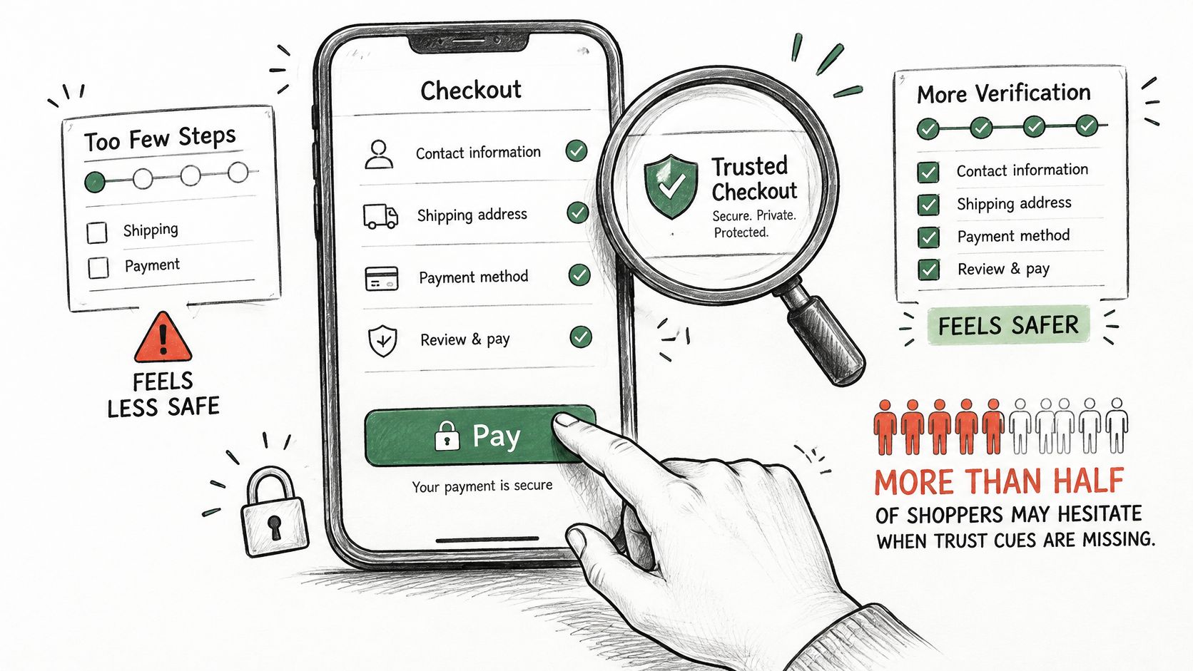
The ClearSale and Experian trust-gap report says 83% of U.S. consumers believe companies should actively address security and privacy concerns, while its MENA findings indicate 17% of consumers in the UAE, Egypt, and Saudi Arabia regularly abandoned purchases when asked for a one-time password. Those findings support explaining authentication, not removing safeguards indiscriminately.
Make verification recoverable
Place familiar express wallets and relevant local methods above manual card entry when they're eligible. Use returning-customer recognition to reduce re-entry, but don't expose saved personal information merely because someone typed a known email address.
Explain a verification request in a short, factual sentence. Tell the shopper whether they need to approve the payment in their banking app or enter a code, and provide a clear route back if the challenge fails.
Preserve nonsensitive entered information after a failed attempt. A shopper who mistypes a one-time password should return to the same checkout with the address intact, not face an empty form and uncertainty about whether payment happened.
For implementation planning, the guide to Stripe checkout payment methods can help teams distinguish payment-method configuration from the surrounding checkout layout.
The following video provides an additional viewing resource alongside the payment-flow review.
Don't force account creation before payment just to make recognition easier next time. Explain any save-details choice separately, including what the shopper is agreeing to.
Start with the methods your customers use, then inspect which eligible options appear immediately. A long list of unfamiliar payment logos isn't a substitute for a familiar, reliable way to pay.
Accessibility Traps in a Dense Single Screen
Consolidation doesn't automatically make checkout accessible. Contentsquare's ecommerce accessibility snapshot reports that 94% of ecommerce sites had inaccessible checkout journeys across five major European markets and that 84% of checkout pages failed to label buttons and form fields properly for assistive technologies.
Those are basic interaction failures, not cosmetic defects. A shopper can understand the product and accept the price yet still be unable to identify the payment button or correct an address.
Reduce what's visible without hiding what matters
Progressive disclosure means revealing controls when they become relevant. It can keep a single page manageable, provided the expanded content is available to assistive technology and the shopper understands what changed.
Associate labels programmatically with inputs rather than relying on placeholder text. Preserve a logical focus order, and make sure a collapsed section doesn't conceal a required field with an unresolved error.
An address autocomplete can look polished while trapping keyboard focus inside its suggestions. A wallet button can be visually familiar but unusable to a screen-reader user if it has no accessible name.
A checkout isn't complete because its happy path works with a mouse. Shoppers must also be able to identify, correct, and recover from mistakes.
Test the journey rather than the screenshot
- Complete it with a keyboard. Move through delivery options, address suggestions, payment selection, and purchase submission without a mouse. Check that focus remains visible and never becomes trapped.
- Enlarge the interface. Use browser zoom and a narrow viewport to check for overlapping labels, clipped totals, and controls pushed outside the usable area.
- Trigger validation errors. Confirm that a screen reader announces the problem and that an error summary provides a route to the affected field.
- Inspect embedded widgets. Test address and payment components themselves, not just the surrounding page. Third-party ownership doesn't make an unusable control acceptable.
Adopt a release acceptance standard that requires successful keyboard completion, labeled controls, readable reflow, and understandable error recovery. Combine automated checks with manual assistive-technology testing, and block launch when a shopper cannot complete or safely recover the purchase.
Metrics to Track Beyond Conversion Rate
Google's analysis of mobile data from 37 brands found that a 0.1-second improvement in load time was associated with an 8% increase in retail conversions, according to its Milliseconds Make Millions report. That's evidence for treating performance seriously, not a promise that every checkout optimization will reproduce the result.
Overall conversion can conceal problems. A flow may work well for wallet users while declining valid card payments or leaving keyboard users unable to finish.
Checkout metrics to track and how to segment them
| Metric | What it reveals | Segment by |
|---|---|---|
| Checkout completion rate | Overall health of the flow | Device, country, payment method, new versus returning |
| Field-level abandonment | Which field precedes drop-off | Device and field |
| p75 largest contentful paint | Real-user render speed of the checkout | Country and network |
| p75 interaction latency | Responsiveness of fields and buttons | Device and browser |
| Payment authorization rate | Share of payments approved | Payment method and market |
| False-decline rate | Good customers wrongly refused | Payment method and market |
| Keyboard-only completion rate | Whether the flow works without a mouse | Browser and device |
Measure real users and controlled journeys
Use real-user monitoring for time to first byte, largest contentful paint, and interaction latency. Review median and upper-percentile values, commonly labeled p50, p75, and p95, so a healthy average doesn't conceal poor experiences on slower networks.
Track payment authorization duration and end-to-end completion time separately. Don't classify every unsuccessful authorization as a false decline; that requires additional payment-provider or reviewed outcome evidence.
Build Playwright tests for cold-cache mobile journeys, wallet and card paths, discount application, subscription renewal, failed-payment recovery, and inventory changes. Verify the resulting order and payment status, not just that a confirmation message appeared.
Connect releases to operational outcomes
Treat a checkout latency regression as a potential revenue-impacting incident. Compare deployment timing with payment errors, field-level abandonment, and authorization success before deciding whether to continue or roll back.
Use an ecommerce analytics dashboard to keep these measures visible together. Choose a small set of priority metrics, assign an owner to each, and establish targets before the next release rather than selecting favorable measures afterward.
Decide Whether One Page Checkout Fits Your Store
Pilot one page checkout first when your catalogue is straightforward, shoppers commonly return, and express wallets can eliminate much of the typing. Mobile-heavy traffic strengthens the case only if the remaining form stays manageable on a small screen.
Keep a multi-step flow when shoppers must work through substantial B2B information, complicated delivery choices, or tax and regulatory requirements. Separate stages can provide useful structure when the tasks need explanation.
Choose a contained pilot
Start with a clearly defined segment, such as mobile shoppers using an eligible wallet. Compare completion against the baseline for that same device and payment method, not against an overall store average with a different customer mix.
Keep offers, shipping rules, and acquisition activity as consistent as practical. Otherwise, you won't know whether shoppers responded to the interface or to a changed commercial proposition.
- Keep the change where completion improves without deterioration in payment quality or error recovery.
- Investigate mixed results when one group improves but another struggles. Inspect the affected fields and payment path before expanding.
- Roll back the affected segment when abandonment rises or customers cannot reliably recover from failures.
Write down your decision criteria
List the checkout criteria that matter most to your store: perhaps returning-customer convenience, complex delivery selection, and keyboard completion. Mark which layout supports each requirement with the least unnecessary work.
For merchants using our platform, PlatformDTC Checkout is a one-click checkout served from the merchant's own host and branded from its own settings. It can run on the merchant's own domain and accepts Apple Pay, Google Pay, PayPal, Link, Amazon Pay, and Klarna.
That gives the pilot a practical starting point, but the decision still belongs to the measured customer journey. Choose the layout that helps your shoppers finish accurately and confidently, not the one with the simplest label.
PlatformDTC offers branded checkout on your own domain with express payment options, so you can evaluate a shorter purchase journey without treating page count as the goal. Visit PlatformDTC to build and publish a store at no cost, then test your checkout with a defined customer segment; you pay only when you make a sale.