
Seven out of every ten carts end without an order. Baymard Institute's 14-year tracking puts the global average cart-abandonment rate at 70.19%, and its checkout usability research points at something more useful than resignation: most of that loss isn't shoppers changing their minds, it's friction they can't get through.
That single reframe changes how you spend the budget. Checkout page optimization isn't a visual redesign with a nicer button. It's a ranked list of frictions, each with a measurable cost and a metric that proves whether you fixed it. The work below orders those frictions by how many abandoning shoppers each one explains, then ties every change to a measurement and a guardrail.
Table of Contents
- Where Shoppers Abandon Checkout and What to Fix First
- Metrics to Track After Every Checkout Change
- How to Audit Your Checkout Step by Step
- Page Speed and Express Wallets That Lift Conversion
- Matching Payment Methods to Markets and Shoppers
- Accessibility Fixes That Protect Completed Orders
- Confirm Your First Checkout Fix This Week
Where Shoppers Abandon Checkout and What to Fix First
Baymard Institute surveyed U.S. online shoppers and set aside the people who were only browsing, so what follows describes shoppers who intended to buy and then didn't. Ranked by how many cited each reason, the causes line up almost one to one with a first fix you can ship.
| Abandonment cause | Share of shoppers | First fix to test |
|---|---|---|
| Extra costs such as shipping, tax or fees too high | 48% | Show the full total on the cart page |
| Site required account creation | 24% | Offer guest checkout |
| Delivery too slow | 22% | State delivery dates before payment |
| Did not trust the site with card information | 18% | Add visible security cues near card fields |
| Checkout too complicated or lengthy | 17% | Remove non-essential visible fields |
| Total cost not visible before checkout | 16% | Display total cost early in the flow |
| Site errors or crashes | 13% | Monitor checkout errors and test the full payment path |
| Insufficient payment methods | 9% | Add wallets and local methods for your markets |
Read the top three rows again. The biggest causes are money, an unwanted account, and uncertainty about when the parcel lands. None of them is about button shape, hero imagery, or the color of your progress bar. Those get fixed first anyway, because they're the things a design file can show and a stakeholder can approve.
Ranking rule: ship the rows that touch cost and account friction before you approve a single visual change. They're also the cheapest to build.
Two rows overlap on purpose. "Extra costs too high" and "total cost not visible before checkout" are the same wound viewed from different angles, which is why the fix for both is showing the landed total, shipping included, on the cart page rather than one click before the card form. Shoppers who learn the shipping number at the last step don't negotiate. They leave.
The 24% on account creation is self-inflicted and reversible. Ask for an email, take the order, and offer a password on the confirmation page when the shopper is in a good mood and you already hold their address.
Find the two rows your own exit data points to and fix those before anything else. If you don't collect exit reasons yet, start with cost transparency and guest checkout, because those two sit at the top of nearly every store's list.
Metrics to Track After Every Checkout Change
Clicks and page views tell you what people did with their fingers. They don't tell you whether money arrived. A checkout change should be judged on a small set of funnel numbers that survive a finance review.
| Metric | How to calculate it | Where to check |
|---|---|---|
| Checkout completion rate | Completed orders divided by checkouts started | Checkout funnel report |
| Time to complete | Median seconds from first field to confirmation | Session data or analytics timing |
| Field correction rate | Fields corrected divided by fields filled | Form event logs |
| Error incidence | Checkout errors per 100 attempts | Error monitoring tool |
| Payment method conversion | Completions by method divided by method selections | Payment dashboard |
| Mobile versus desktop completion | Completion rate split by device | Analytics device segment |
Wire these into the funnel view you already keep, the kind of view set up in this guide to an ecommerce analytics dashboard, so completion and error rate sit next to traffic instead of in a separate spreadsheet nobody opens.
Test design matters as much as the metric list. Change one variable per test, wallet position or field count or page layout, never all three. Split traffic evenly across the full population rather than new visitors only, and let the test run through at least one complete weekly cycle so weekday and weekend buyers both land in the sample.
Conflicting results are the interesting part. If completion rises while refunds and support contacts rise with it, you probably pushed people into a product or a shipping promise that doesn't hold, and the "win" costs more than it earns. If a speed change helps desktop and does nothing on mobile, the bottleneck was a desktop-only script or a separate mobile render path, not page weight.
Set a cadence and keep it: funnel metrics weekly, refunds and fraud monthly. And write the baseline down before you touch anything, because without a dated starting number a later lift gets credited to whichever change shipped last.
How to Audit Your Checkout Step by Step
An audit is a walk, not a report. Do it on a real phone, on a real connection, with a real cart containing something you'd buy.
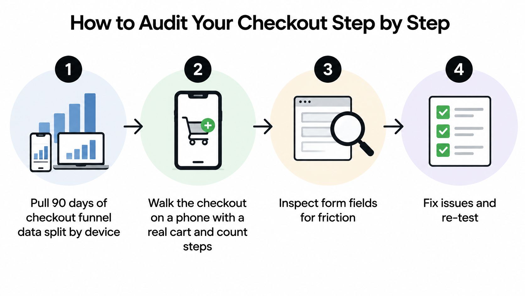
- Pull 90 days of funnel data split by device. Mobile drop-off hides inside an acceptable blended average. A store completing at 68% overall can sit at 61% on phones and nobody notices until the split is on one screen.
- Count steps and fields on a phone. Baymard's benchmark puts the average checkout at 5.1 steps and 11.3 form fields, and its testing cites 14% of users abandoning when a phone number is required, so anything well above that average, or any globally mandatory phone field, deserves a hard look (Baymard checkout usability benchmark).
- Mark every field fulfillment doesn't strictly need. Title, company, second address line, and marketing opt-ins are all places a shopper can quit. Defer them.
- Verify shipping cost and delivery timing appear before the payment button. Late disclosure creates exits even on a fast page. Confirm it on the smallest screen you support, not the desktop mockup.
- Break the form on purpose. Submit a wrong postcode and a malformed phone number, then check whether the error appears inline, names the field, and preserves what was already typed. Errors that wipe input are a refund on trust.
- Record load time and the slowest elements on a mid-range Android phone over 4G. Not a flagship on office Wi-Fi, and not the desktop emulator.
- Rank findings by drop-off impact against build effort. Write one sentence per finding: the change, and the metric it should move, using the definitions you already track.
The common slip in step two is collapsing fields into poorly labeled accordions, which reduces the count and keeps the friction. The slip in step four is trusting your own memory of the flow instead of walking it.
A healthy checkout passes five checks: the full total is visible on the cart page, guest checkout is the default path, errors appear inline and name the field, typed values survive an error, and the first meaningful paint arrives fast enough that nobody wonders whether the page is broken.
Page Speed and Express Wallets That Lift Conversion
Google's Milliseconds Make Millions analysis, based on mobile-site data from 37 brands across retail, travel, luxury and lead generation, found that a 0.1-second change in load time could influence every stage of the user journey. When performance improved, average conversions rose 8% for retail and 10% for travel.
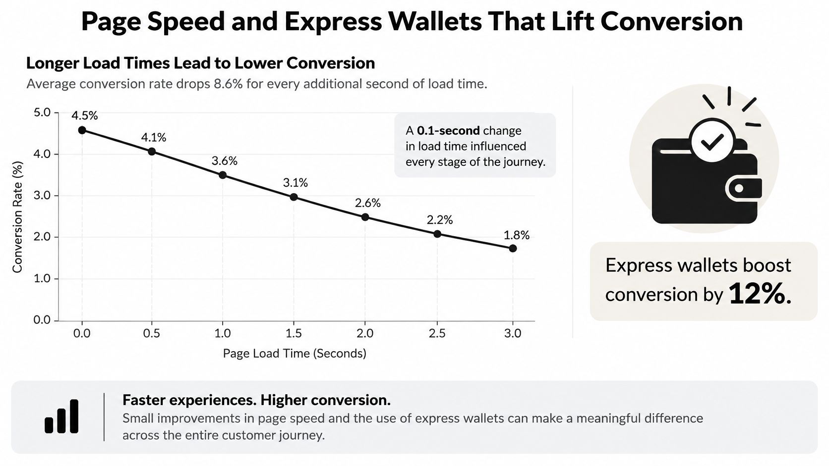
Start with the checkout route's real-user latency, then identify what is slowing it down. Defer chat and tag scripts that do not need to run during payment, reduce checkout assets, and serve the page from an edge network close to the shopper. Track completed orders alongside latency, and watch for errors or failed payments so a faster page does not mask a broken payment flow.
Express wallets address a different source of friction: typing. On mobile, place available wallet buttons above the manual form. A shopper who pays with a wallet can skip entering address and card details, but confirm that each option appears on the devices and browsers where it is supported.
| Lever | Source | Conversion change | Revenue change |
|---|---|---|---|
| Load time improved by 0.1 s on mobile, retail | Google Milliseconds Make Millions | +8% | Not reported |
| Load time improved by 0.1 s on mobile, travel | Google Milliseconds Make Millions | +10% | Not reported |
| Relevant payment method beyond cards | Payment-method analysis | Associated with higher conversion | Associated with higher revenue |
| Apple Pay acceptance among eligible checkouts | Payment-method analysis | Associated with higher conversion | Associated with higher revenue |
| WeChat Pay acceptance among eligible checkouts | Payment-method analysis | Associated with higher conversion | Associated with higher revenue |
These findings are associations, not forecasts for an individual store. Test one change at a time, measuring completed-order conversion and keeping payment errors and refund rates as guardrails. A wallet button that improves mobile completion but causes more failed authorizations is not a win.
Matching Payment Methods to Markets and Shoppers
Offering every payment method can clutter checkout without helping shoppers. Merchants offer only four to five payment methods on average, while cards, digital wallets, and bank-transfer or debit methods each reach more than half of merchants worldwide, according to Visa's 2025 global payments and fraud research. Shoppers who cannot find a preferred way to pay may abandon rather than switch, so match options to the buyer, device, and market.
| Segment or market | Variable to test | Guardrail to watch |
|---|---|---|
| Returning mobile shoppers | Wallet button placed above card fields | Authorization rate |
| Cross-border orders | Local method shown by currency | Fraud loss |
| Subscription sign-ups | Stored wallet offered for renewals | Failed-payment rate |
| B2B invoice buyers | Invoice or bank transfer option | Refund and support volume |
| High order value carts | Pay-later option visibility | Chargebacks and fees |
Test one market at a time and keep each change live through a full weekly buying cycle. That helps distinguish a sustained result from shifts in buying patterns. For Stripe-specific setup and failure modes, see this guide to Stripe checkout payment methods.
Judge each method by completed orders and its operating costs. A wallet that raises completion but lowers authorization, increases chargebacks, or creates refund work may cost more than it returns. Track authorization rate, fraud loss, processing fees, refund complexity, and support volume alongside conversion. A method may be worth keeping in one country and disabling in another.
For subscriptions, confirm that the payment method supports automatic renewals and that failed payments can be handled. For every sales channel, make sure the resulting order remains visible in the merchant's order records. A method that works only at initial checkout can create extra work after the sale.
Accessibility Fixes That Protect Completed Orders
Some checkout failures block access entirely. Missing form labels, errors shown only through color, or a payment modal that traps keyboard focus can prevent shoppers from completing an order. The funnel records the result as an ordinary drop-off, even when the shopper could not use the page.
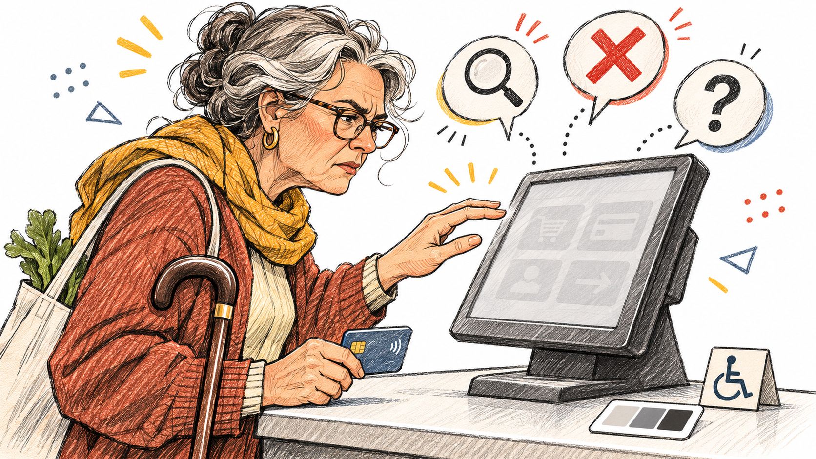
Start with fixes that remove common barriers:
- Keep labels visible after a shopper enters a value. Placeholder text disappears as they type.
- Describe errors in text and name the affected field. “Postcode must be five digits” is clearer than a red outline alone.
- Set a logical focus order from address to payment to submit, so keyboard users can move through checkout predictably.
- Make wallet buttons keyboard-operable, with a usable fallback if a wallet script fails to load.
Test in two passes. Automated WCAG checks can flag contrast and label problems, then people who use assistive technology can try a purchase, including recovery from a declined card. Use the PlatformDTC accessibility page as a starting point for reviewing accessibility in checkout.
Track completion, error loops and support contacts alongside the changes. Where possible, compare those outcomes for shoppers using different input methods. A validation or wallet script that fails for keyboard users can also fail for shoppers on a slow connection, so check both accessibility and resilience.
Confirm Your First Checkout Fix This Week
Take the highest-ranked row from the table that matches your own audit and make it the single change for this sprint. For most stores that's the landed total on the cart page or guest checkout, and both can ship in days rather than quarters.
Record the baseline first: completion rate, error incidence and device split over the last 30 days, defined exactly as in the metrics table. Then run the change as a split test for two to four weeks, covering at least one full weekly cycle. Roll it out only if completion improves while refunds, errors and support volume hold steady.
If you're evaluating a platform, hold it to the same list. PlatformDTC Checkout is fully responsive and mobile-first, runs on the merchant's own domain, and accepts Apple Pay, Google Pay, PayPal, Link, Amazon Pay and Klarna alongside cards and pay-later options, with fraud checks and dispute answers built in. Test any platform against your own baseline and your own criteria before you commit, not against a demo.
Fix the most expensive friction first, and measure every change against its guardrails. Completion without stable refunds, errors and support volume isn't an improvement, it's a delayed cost.
PlatformDTC gives DTC brands a checkout they can tune: it's served from their own domain in their own branding, takes cards, wallets and pay-later options in one flow, and keeps subscriptions, orders and customer records on the same system. That means the fixes ranked above, from total-cost transparency to wallet placement to error monitoring, can be shipped and measured against one baseline instead of stitched across five apps. If you want to see how it compares to your current checkout, visit PlatformDTC and run the audit in this guide against it.